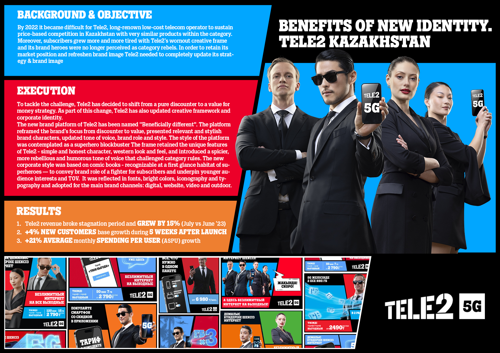
Tele2 has entered Kazakhstan over 10 years ago and due to its discounter strategy has managed to win over consumers’ love and become the second biggest telecommunication provider in the country after Beeline. However, by 2022 it became difficult to sustain price-based competition with very similar product propositions from different brands while subscribers grew more and more tired with Tele2’s wornout creative frame and brand heroes who were no longer perceived as category rebels. In order to retain its market position and refreshen the brand image Tele2 needed to update its strategy. Therefore, Tele2 has decided to shift from a pure discounter to a value for money strategy in terms of price, quality and additional product benefits. This way consumers get not only low prices but also unique innovative features and even lifestyle benefits. As part of this change, Tele2 has also updated creative framework and corporate identity. The new brand platform of Tele2 was pronounced as "Beneficially different". The platform reframed the brand’s focus from discounter to value, presented relevant and stylish brand characters, updated tone of voice, brand role and style. The style of the platform was contemplated as a superhero blockbuster with four main characters - Tele2’s Guardians of Benefit, a special unit that confronts “organized disbenefit” in mobile communication. The guardians tackle supervillains who represent market unfairness and hidden limits, rescue subscribers and solve consumer problems by introducing them to innovative and value adding products of Tele2. The frame retained the unique features of Tele2 - simple and honest character, western look and feel, and introduced a spicier, more rebellious and humorous tone of voice that challenged category rules – most desired features according to internal research. The new corporate style was based on comic books - recognizable at a first glance habitat of superheroes and was reflected in fonts, bright colours, iconography and typography and adopted for the main brand channels: digital, website, video and outdoor. Superhero style conveyed the brand’s role of the fighter for consumers’ value and underpinned younger audience interests and tone of voice.
